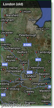
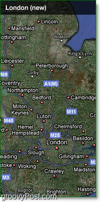
Recently the Google Maps blog announced updates: walkways, bus stops, address labels, street width and even an improved font! Although some of the changes don’t exactly POP OUT, when combined, the changes are significant to the naked eye. Below is an example of the Before and After of London. At first, you might not see the difference, but if you spend a few seconds comparing them, you will notice the map of the city has improved visibility. For instance, when looking at the center of the map, the roads are more accurate, detailed, and visible from a further zoom-out ratio. Take a look at your local maps and see for yourself the new changes. Evolving the look of Google Maps[via theGoogleOS] Comment Name * Email *
Δ Save my name and email and send me emails as new comments are made to this post.


